


In my last article of a series, I call "Discover Julia", I mentioned that I will be doing a tutorial on the Plots.jl package, which is Julia's foremost data visualization package. In this article, we will deep dive into this package and see how we can use it to represent data visually. Data Visualization is crucial in data-driven decision-making hence, deserves a fair of attention.
Introduction to Data Visualization
Data Visualization is a crucial part of Data Science and by extension data-driven decision-making. Information presented a in a visual form is both appealing and action-driven.
Data visualization is an important part of Data Literacy, hence a crucial skill that is required today and in the near future.
Why Data Visualization
Data Visualization is important because of the following reasons:
1. Finding Anomaly
Data Visualization can help us uncover inherent defects or outliers in a system. This knowledge can be crucial in rectifying the problem while saving resources and even lives.
2. Visualizing Trends
Data Visualization can also help us discover a trend over time in a system. This information can help make feature decisions that will improve the system.Text
3. Finding Relationships and Correlations
Data Visualizing is also important in uncovering inherent relationships and corrections in data. The knowledge can improve decision-making.
4. Frequency Measure
The frequency of occurrence of events(data points ) is also important in decision-making. Since, data-driven decision-making produce wins, this information can import revenue and reduce cost.
Plots.jl
Plots.jl is a visualization interface and toolset for the Julia programming Language with multiple backends for plots. This makes it easy to plot different visuals from the different backends. You can also use Plotlyjs as one of the backends for interactivity.
The goals with the package are:
- Powerful. Do more with less. Complex visualizations become easy.
- Intuitive. Start generating plots without reading volumes of documentation. Commands should "just work."
- Concise. Less code means fewer mistakes and more efficient development and analysis.
- Flexible. Produce your favorite plots from your favorite package, only quicker and simpler.
- Consistent. Don't commit to one graphics package. Use the same code and access the strengths of all backends.
- Lightweight. Very few dependencies, since backends are loaded and initialized dynamically.
- Smart. It's not quite AGI, but Plots should figure out what you want it to do... not just what you tell it.
~Plots.jl
To get started with Plotly.jl, we just have to import it and if we don't have it installed on our machine, then Julia will go and fetch it for us.
We will also use some data from the RDatasets package.
using Plots, RDatasets
Next, we need a backend for our plots. We can use the gr() backend for speed or the plotlyjs() backend for interactivity. Let's start with the gr() backend.
using Plots
gr()
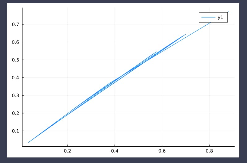
x = rand(10)
y = sin.(x)
plot(x, y)

And to use the plotlyjs() backend for interactivity, you just need to add the following after the import:
plotlyjs()

x = rand(10)
y = sin.(x)

plot(x, y)
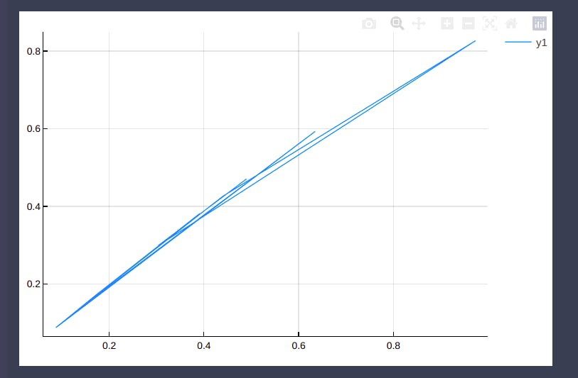
Chart Types and Use Cases
Data Visualization involves using the right visualization to help represent your data. The right chart type will tell a compelling story but the wrong chart will distort meaning, lose you vital credibility, and in some cases lose you and your company a ton of money.
It is therefore important that we learn about the different chart types and what they are used for. Let's start with the Line chart.
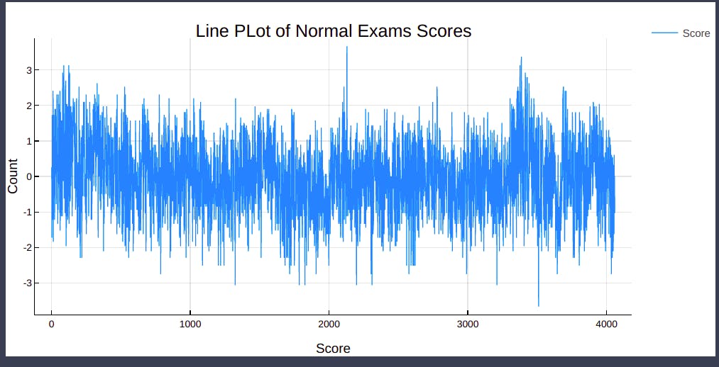
Line Plots
A Line chart is used to show a change over time. The data points on a Line chart are connected with lines and the vertical axis represents the features of the data. The plot moves from left to right showing the continuation.
In Plots.jl, Line plots are created in the following:
using StatsPlots

@df exams plot(
    :NormExam,
    title="Line PLot of Normal Exams Scores",
    label="Score",
    lw=1
)
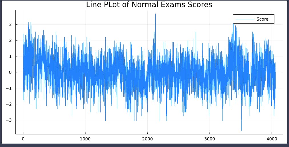
Notice that we are using the @df macro from the StatsPlots package to directly columns by using their names(symbols). We also used the plot function to create a Line chart. We can further enhance our chart by adding x and y labels:
xlabel!("Score")
ylabel!("Count")
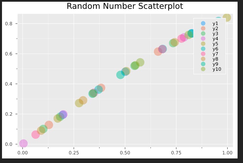
Scatterplot
The Scatterplot is used to show a relationship between two numeric variables. The x and y-axis indicate values from the various variables.
x = rand(4, 10) #x
y = sin.(x) # y

scatter(x, y, markersize=12, alpha=0.4) # create the scatterplot
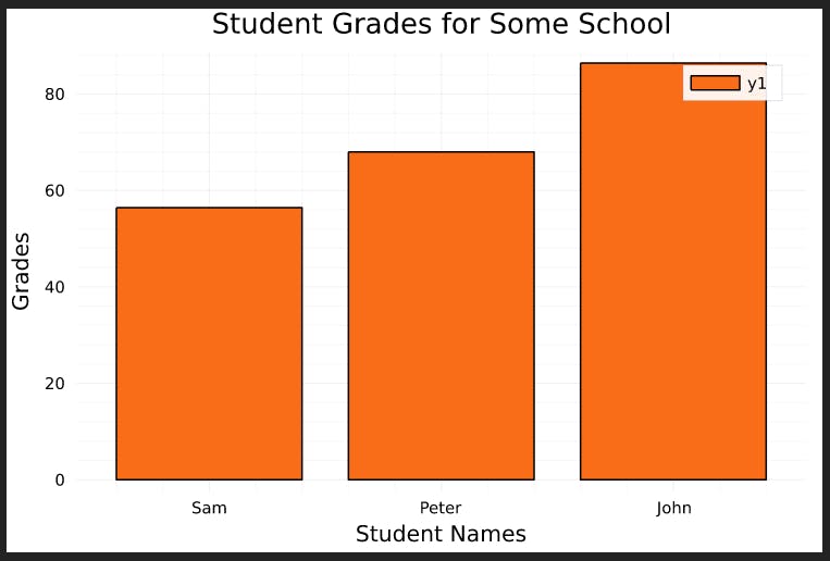
Bar Plots
A Bar chart is used to show quantitative or discrete values in a dataset. The height of each bar shows the frequency of the values in each group.
using PlotThemes

# using the :vibrant theme
Plots.theme(:vibrant)

names = ["Sam", "Peter", "John"]
grades = [56.4, 68, 86.4]

bar(names, grades, title="Student Grades for Some School")
xlabel!("Student Names")
ylabel!("Grades")
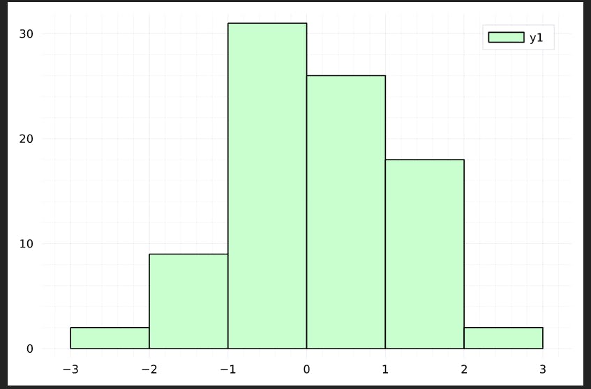
Histogram
A Histogram is similar to a bar chart but is used when data values are continuous numeric. Bars are plotted together to show the continuous nature of the values. The values are divided into bins.
histogram(randn(88), color=:algae)
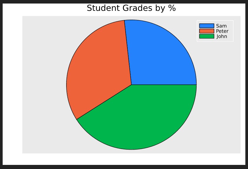
Pie Chart
A Pie chart is used to show the relationship of a part to the whole. Values in a pie chart should amount to 100% indicating a complete value.
# using the :ggplot2 theme
Plots.theme(:ggplot2)

names = ["Sam", "Peter", "John"]
grades = [56.4, 68, 86.4]

pie(names, grades)
title!("Student Grades by %")
annotate!()
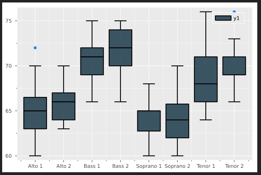
Box Plot
A Boxplot is used to compare the distribution and skewness of numerical data using averages and data quartiles.
Boxplots are not directly available in Plots.jl but can be accessed in its companion the StatsPlots.jl package. Others Statistical Plots like the violin, dotplot, corrplot, etc are also available in the StatsPlots.jl package.
using StatsPlots
import RDatasets
singers = RDatasets.dataset("lattice", "singer")

@df singers boxplot(string.(:VoicePart), :Height, fillalpha=0.75, fill=:thermal, linewidth=2)
Concluding Thoughts
Data Visualization is a crucial part of the data ecosystem and hence has a vital role in any analysis. Good visualizations drive decision-making. Julia's Plots.jl make it easy and intuitive to visualize your data and help inform decision-making.